 |
| Bootstrap 4 Navbar |

Navbar with Background
To create navbar with color variation, include any of the contextual classes (.bg-primary, .bg-secondary, .bg-warning, .bg-danger, .bg-success, .bg-light, .bg-dark, .bg-info) to your navbar.Navbar with Dropdown

Navbar with Forms and Buttons
You can include inline forms or buttons to your navbar.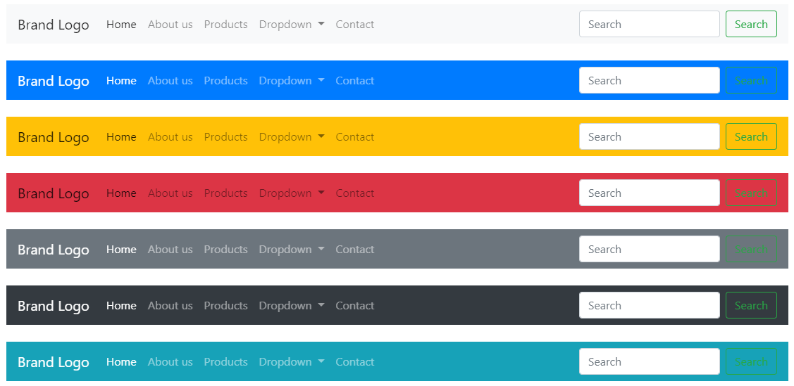
Navbar Position - Default
Navbar Position - Fixed Top
Navbar Position - Fixed Bottom
See the Pen Bootstrap 4 Navbar Position - Fixed Bottom by Prime Study Hub (@PrimeStudyHub) on CodePen.
Navbar Position - Sticky Top
See the Pen Bootstrap 4 Navbar Position - Sticky Top by Prime Study Hub (@PrimeStudyHub) on CodePen.
Navbar External Content
The Navbar not only used as a menu, but it can also be used as an accordion toggle to show/hide external content. Here's an example of navbar external content,
Comments